2.11.2010
11.04.2009
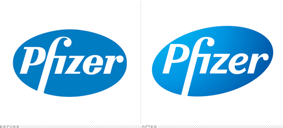
Pfizer logo now more 'efficacious.'

New look for Pfizer. The gradient is useless, and the P nearly collides with the edge of the oval. Other than that, a nice upgrade, especially with the softer, italicized 'e'.
Labels: design, drug companies, logos
1.26.2008
Make the logo uh ... 250% bigger.

Do big truck badges = satisfied buyers? Kicking Tires measured each of the badges adorning the latest big truck models at the Detroit International Auto Show and well, in a design sense, the results weren't pretty.
Labels: cars, consumer product, design, enough already, ford, logos, toyota
8.08.2007
More fun from Oddee

I'm sure you've seen these unfortunate logos before, but they made me laugh again and that's really all that matters.
6.11.2007
Dairy Queen finally gives up.

Apparently, the power of the meaningless swoosh is unstoppable. I commend them for holding out this long.
Labels: enough already, logos, swooshes