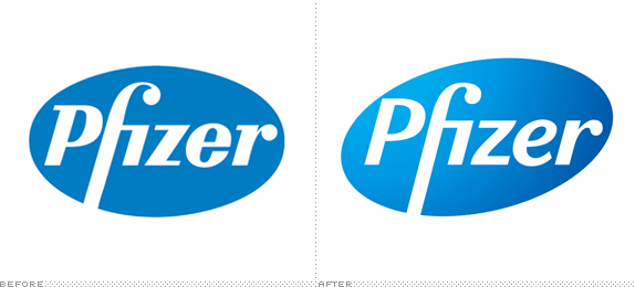
Pfizer logo now more 'efficacious.'

New look for Pfizer. The gradient is useless, and the P nearly collides with the edge of the oval. Other than that, a nice upgrade, especially with the softer, italicized 'e'.
Labels: design, drug companies, logos

Labels: design, drug companies, logos
0 Comments:
Post a Comment
Subscribe to Post Comments [Atom]
<< Home